Open Menu

David Dinsmore

Designer + UI Developer

Simple Truth

  • Design
  • Design by RockFish
  • Development
  • HTML/ LESS
  • Mura CMS Integration
  • jQuery
  • Visit
  • No longer available

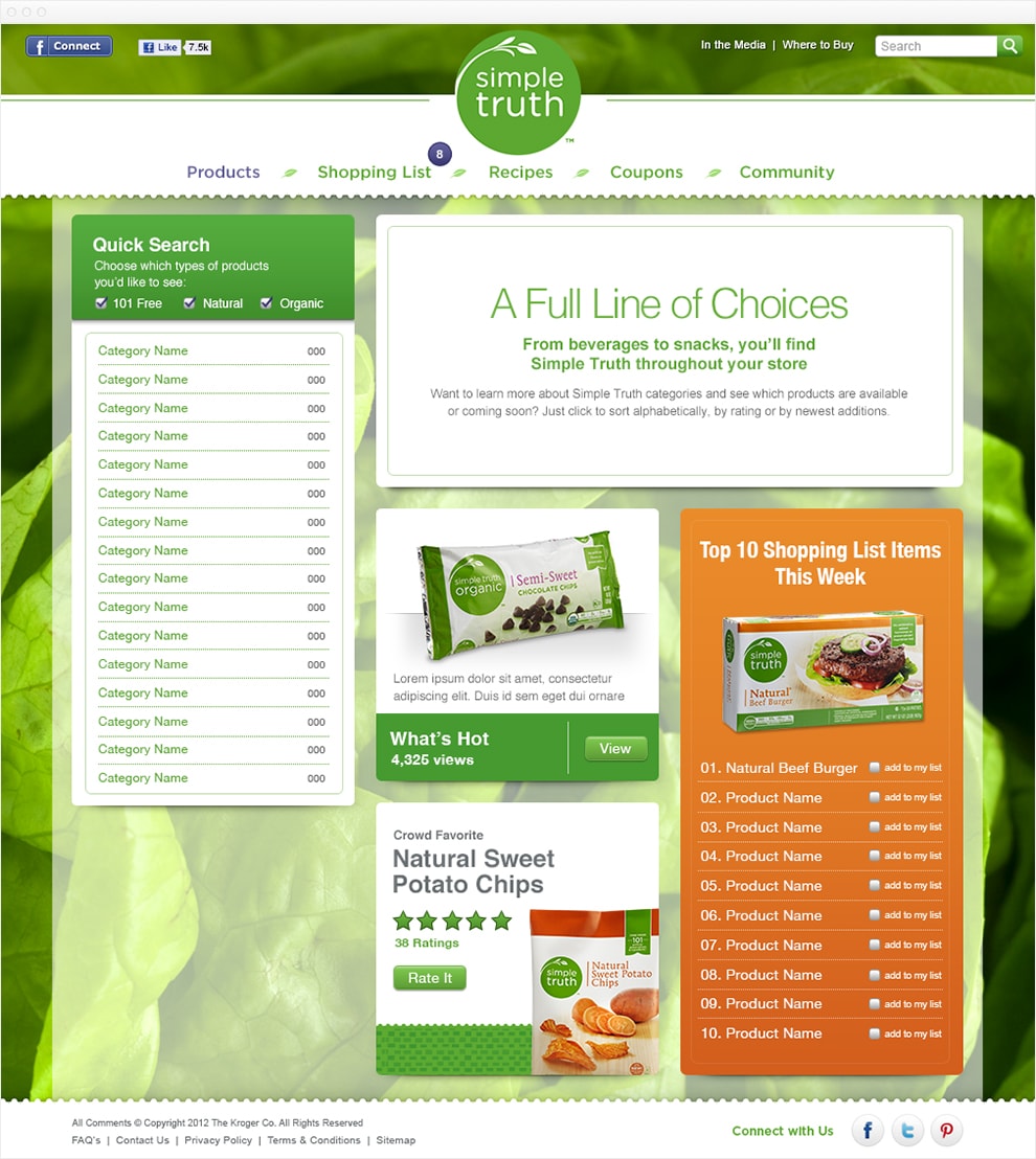
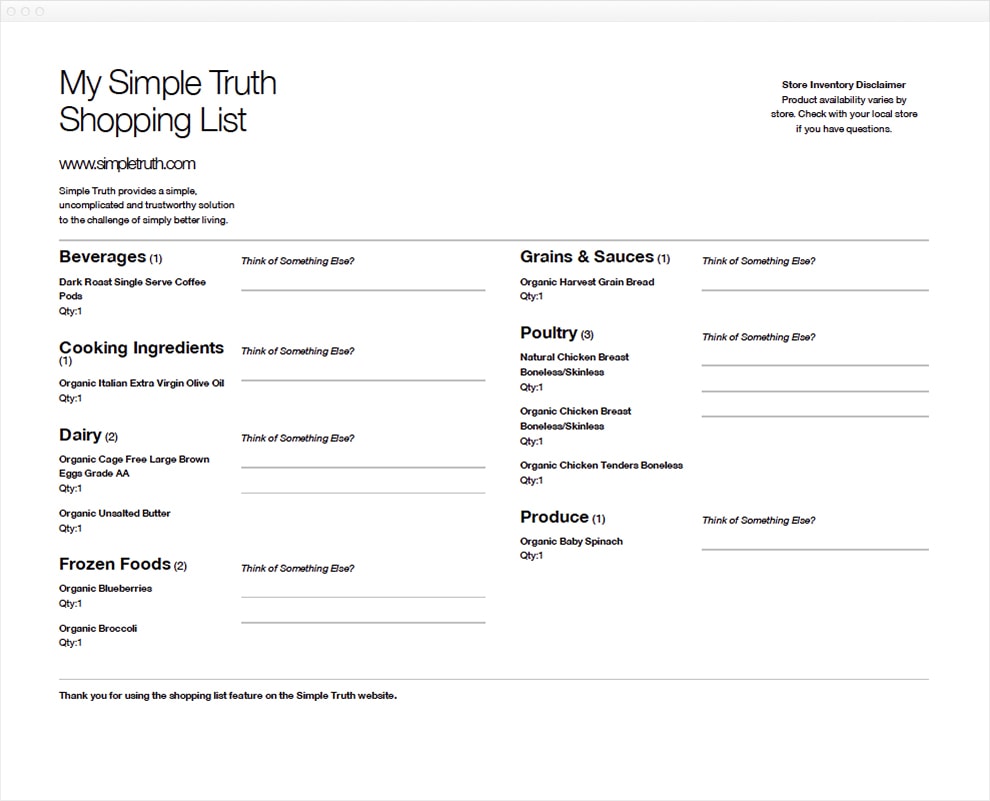
To celebrate the launch of their natural and organic private label brand—Simple Truth—Kroger asked the team at Global Cloud to build a stand-alone flagship website.

As the Senior CMS Developer, I led a small team of front-end developers that built a custom theme that was easy for site editor to update—while allowing content to be placed almost anywhere.

Screen capture of the Simple Truth homepage. The header has a white banner with a centered green Simple Truth logo. The main navigation is green text set in a rounded font. The first link, Products is the active link, and is colored purple. The other nav items are Shopping List, Recipes, Coupons, and Community. A large white call out is just below the header. An image of a basket of mushrooms is on the right side and a title with green text reads Putting simple within reach. The main content of the home page features six square tiles. Three tiles have purple backgrounds are calls to action to other parts of the site. Two of the tiles features an individual product with a star rating. The last tile is a link to a recipe. The footer.
The homepage features a variety of "tiles" that help guide users through the site. From reviews and recipes to products and blog posts links the homepage can be updated easily to showcase a variety of layouts.
Screen capture of an interior page on Simple Truth. The left column has a quick search feature with three check boxes that filter the search to "101 Free", "Natural", and "Organic". The right column has a large white banner at the top promoting "A full line of choices". The right column is split into two equal columns under the white banner. The left column has two "Tiles", one is link to a HOT product, the other is asking for a rating for a bag of potato chips. The right column is list of the top 10 shopping list items for this week. Next to each item is a check box letting users add that item to their shopping list.
Product pages highlights more content "tiles" and the Top 10 shopping list items of the week component.
Screen capture of a printable shopping list. The printable shopping list is split into two columns and is in black and white, with no graphics. The shopping list is printer friendly and list out each item on the shopping list. Items are grouped by category and display the item name and quantity as well as an extra line for writing in extra notes.
Printable Shopping list filters items by category.
Screen capture of the recipes page. The left column is a list  of categories. The right column features a large white banner that reads "Recipes in Good Taste". Below the white banner two columns of four tiles promote featured products.
Easy to make recipes featuring Simple Truth products.

Let's Work Together

Email me at dinsmore@hey.com