Open Menu

David Dinsmore

Designer + UI Developer

Hi!

I'm David, a Designer and UI Developer living in sunny Long Beach, California.

Currently I'm helping the team at TollFreeForwarding develop an international telecommunications service.

In my spare time I run an online March Madness pick'em bracket. As well as help small businesses with their sites big and small. I love learning new HTML and CSS features by building Dribbble shots I find interesting on Codepen.

I also love Southern California. Moving away from the frozen winters of Ohio has let me enjoy slicing golf balls year round! When I’m not on the golf course, you can find me outdoors with my wife, taking photos around California.
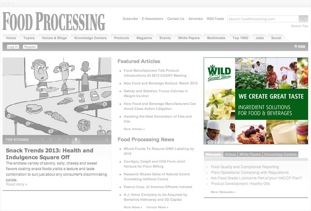
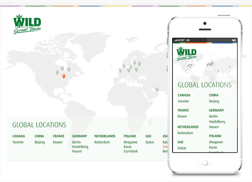
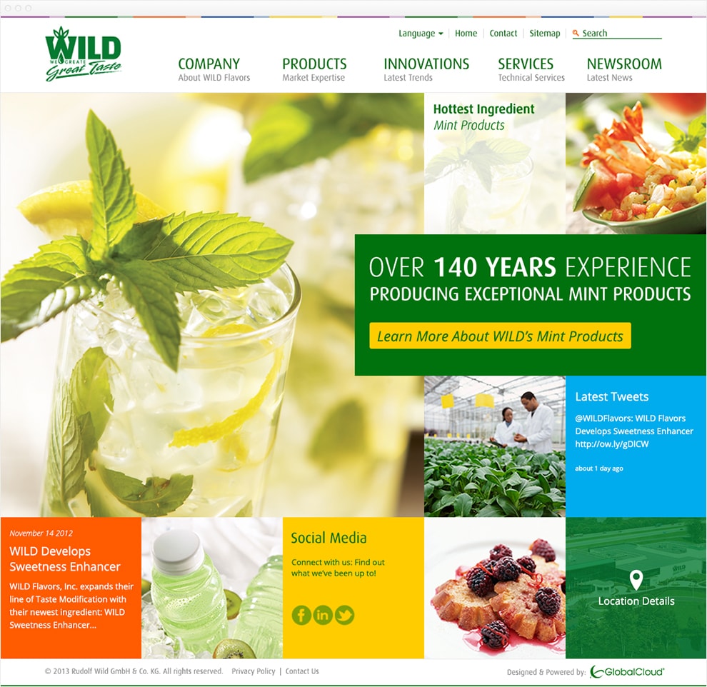
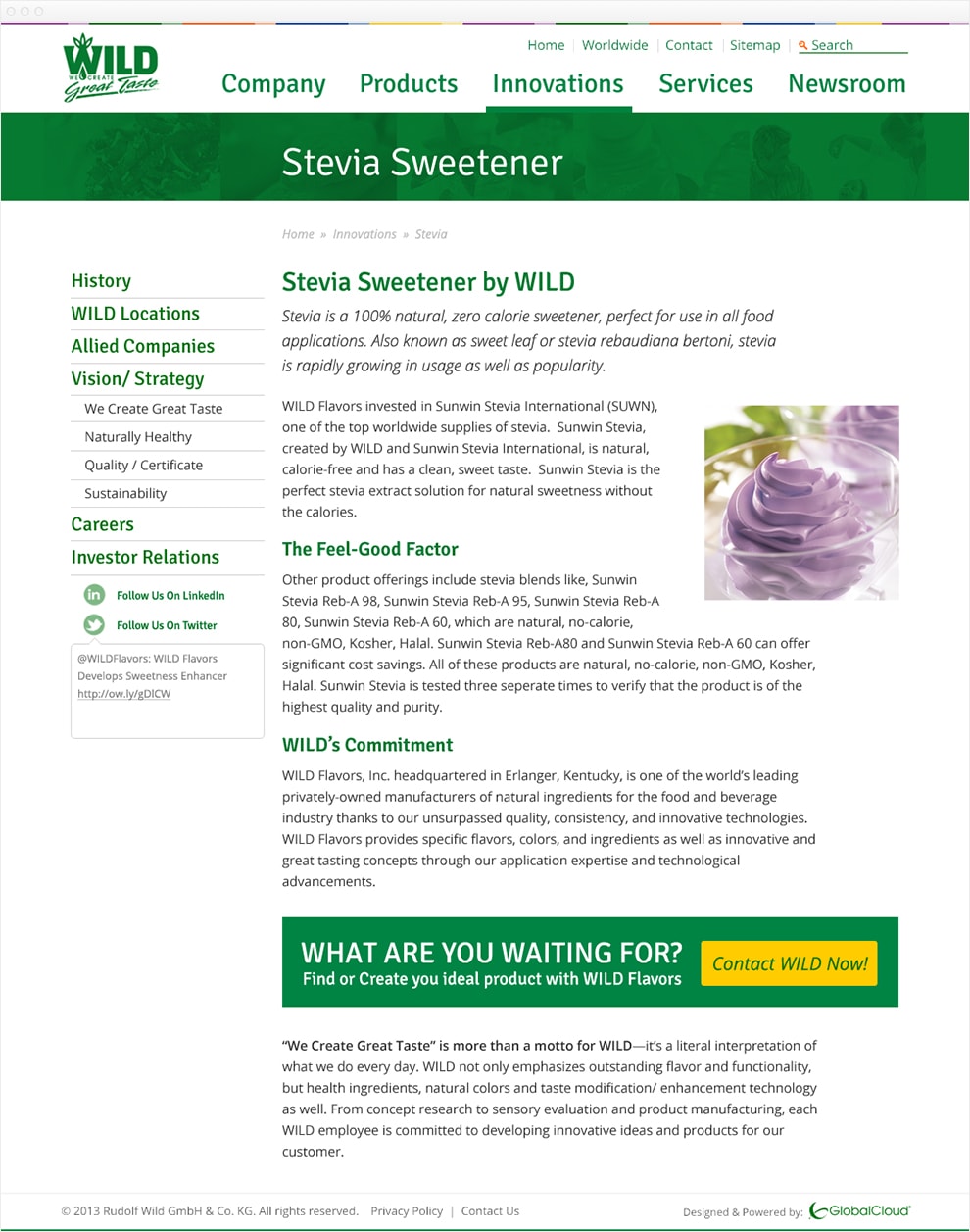
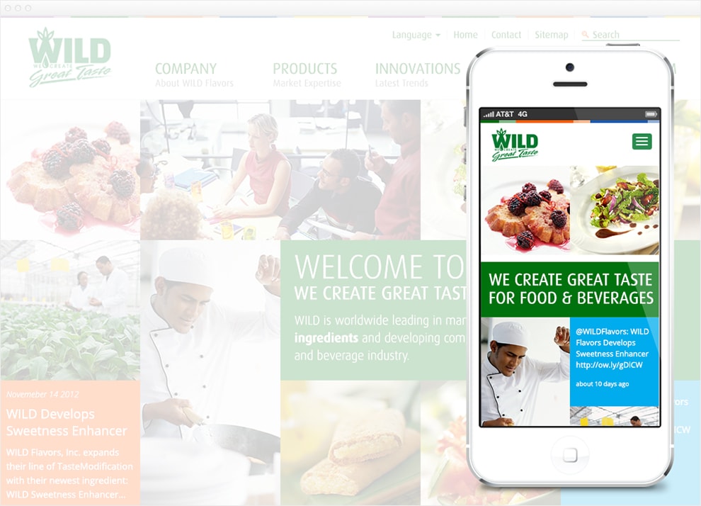
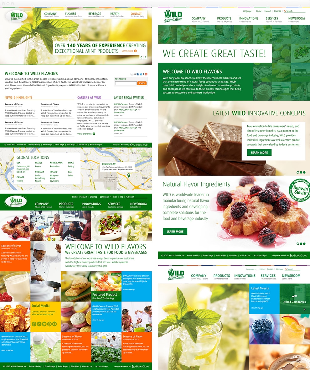

WILD Flavors

  • Design
  • Creative Direction
  • Visual Design
  • Banner Ads
  • Development
  • HTML/ LESS
  • Mura CMS Integration
  • jQuery

WILD’s vision is to be the global driving force for naturally healthy, great tasting products. Embracing the extraordinary, they set trends, create tastes, and lead with innovation.

While at Global Cloud I managed a small team of designers and front-end developers who embraced that extraordinary spirit and delivered a responsive corporate Content Management System without the suit.

Grayscale screen capture of a website with a full color 350 pixel by 350 pixel banner ad. The banner ad is divided into 8 squares, a 3 row by 3 column grid. The top left square has a white background and the WILD Flavors logo in dark green. The next two images in the top row are picture of two scientist talking about flavors with small plants in the foreground, and a family enjoying dinner, the mother is holing a piece of fruit above her sons mouth. The second square of the second row is an image of two mojitos on a white background. The next two square contain white text on a green background. The headline text says in bold all caps, we create great taste. The body text say in all caps, ingredient solutions for food and beverages. The last row of squares contain 3 more images. The first is a close up of a chef sating a dish. The second is a close up of a white plate with two tarts covered in raspberries. The third image is a tilted close up of a glass of milk.
Built on a three by three grid, banner ads can vary "wildly" in content while having a consistent look and feel.
Screen capture of website with a large stylized map of the world as the background. The map has green pins highlighting all the different locations of WILD flavors offices around the world. The current location pin is highlighted in orange. Along the bottom of the page all the global locations are written out. A mock-up of an iPhone 5 sits on top of the image covering the right half. The iPhone shows what the global location splash page looks like on mobile. The map is the same but smaller, and the list of locations along the bottom is now a two column list.
Global landing splash page.
Screen capture of website with a header with a white background and green WILD flavors logo. The main nav is a horizontal list. The first item has a bold green headline that says Company with a sub-headline of About Wild Flavors. The second item has a bold green headline that says Products with a sub-headline of Market Expertise. The third item has a bold green headline that says Innovations with a sub-headline of Latest Trends. The fourth item has a bold green headline that says Services with a sub-headline of Technical Services. The fifth item has a bold green headline that says Newsroom with a sub-headline of Latest News. The main content of the homepage is a 5 column by 4 row grid of images and colors. The main image, a mojitos in a tall glass, takes up the first 3 rows and columns. A banner that breaks out the grid takes up 2 and half columns and 1 row. The break out banner has a green background with white text that says Over 140 Years Experience producing exceptional mint products. A yellow button with green text says Learn more about WILD's Mint Products. Other squares show links for locations, social media links, and latest tweets.
The home page uses a similar grid layout to the banner ads. Each grid item can hold different content types. Some could be image links to other parts of the site, while others could be the latest tweet.
Screen capture of website with the same header and main nav as the previous image. A new full-width green banner with white text that says Stevia Sweetener is just below the header. The interior page is split into two columns. The left column is about 30% of the screen and contains sub-navigation of the Innovations page. The top level links are set in large green text while the second-level links are set in small gray text. Below the sub-nav are links to social media that show the latest tweet. The right column takes up the other 70% of the page and contains text and images about Stevia Sweetener. A large call to action banner is at the bottom of the page. The banner has a green background with white text and a large yellow button that says Contact WILD Now.
Interior Page using a more traditional two column layout with large call-to-action banners.
Screen capture of the tiled homepage, but is now grayed out. A iPhone 5 mock-up covers up the right side of the image. The mock up shows how the tiles on the homepage would look on a mobile layout. Instead of a 5 column by 4 column grid on desktop, the mobile view show a 2 column square grid. The main nav changes to show the WILD logo and a green button with a white hamburger icon instead of the full navigation.
Alternate homepage concept with grid items stacking on mobile.
Additional concepts presented to WILD Flavors.

Let's Work Together

Email me at dinsmore@hey.com